
Wednesday, 18 April 2012


Evaluation Question 7
Q7 Looking back at your preliminary task, what have you learnt in the progression from it to the full product?
The main thing for me about completing the preliminary task was getting used to the programmes I would be using for my final product. Not only this but it helped me to start thinking in a particular way, so that I could produce a magazine. Considering how to photograph a model or a particular object in a way that shows it in its full potential. In addition to this, thinking about the research, and how to layout the progression to the final product was started in the preliminary, looking at narrowing down my research so that it was targeted at what I would produce.
Since completing my preliminary task I have learnt many skills, such as taking photographs, thinking about the posisiton of the model what she is wearing, the make up and the lighting. All of this together would produce a good quality product. Not only this but I learnt how to modify and edit a photograph in Photoshop so that any shadows or imperfections could be taken out of the photograph and in my case edit the colour of the photo to black and white. Along with this I learnt how to use InDesign, a programme that I had never used before, creating layouts, layers of text and objects to create my pages. In particular using the text layout options for the double page spread something I found quite challenging.
Since completing my preliminary task I have learnt many skills, such as taking photographs, thinking about the posisiton of the model what she is wearing, the make up and the lighting. All of this together would produce a good quality product. Not only this but I learnt how to modify and edit a photograph in Photoshop so that any shadows or imperfections could be taken out of the photograph and in my case edit the colour of the photo to black and white. Along with this I learnt how to use InDesign, a programme that I had never used before, creating layouts, layers of text and objects to create my pages. In particular using the text layout options for the double page spread something I found quite challenging.
Tuesday, 17 April 2012
Evaluation Question 3
Q3 What kind of media institution would distribute your media product and why?

These companies already publish music magazines, that have been quite successful, I think that there is a gap in the market for a product like mine, for one of these companies to publish. The unique look of my magazine would appeal to their already unique products they have out there, however mine would be totally different. I think that these media institutions would be able to publish and distribute my product the best.
Wednesday, 28 March 2012

Thursday, 22 March 2012
Making of Double Page Spread


Here are a few screen shots to show the making of my double page spread, the above show how I created my title, putting it on a text path so that it fitted in with the shape of the vinyl. Then picking up the yellow colour from the lighting to give impact to the title. I also started to add the text, including large quotes from the article, a convention of a magazine, along with the illuminated letter at the beginning of paragraphs, and the caption of the photograph.

 After playing around with the layout I decided to use text wrap and put all the text in one box so that it fits on the page more neatly with spacing that gave a more professional look.
I had to look at the writing and layout of the page more carefully. The hyphenated words did not make the page look professional or finished. I also needed to think about the spacing and guttering around the text.
Wednesday, 29 February 2012
Font Experiment Double Page Spread


Tuesday, 28 February 2012

+of+Picture.jpg)


Second Photoshoot for Double Page Spread
I took a second lot of photographs for my contents page as the first few did not come out well at all. This time thinking more about the lighting, reflecting the flash with white paper to create interesting shots. I looked at photographing my Vinyl player, here are three of the best photographs.


First Photoshoot for Double Page Spread


These two pictures have very different colours the one to the right has quite an orange tone to the entire photograph and the one below has a yellow tone to it. Neither of which give a nice effect. In addition to this the background in the photograph does not look very nice.

Research of Photographs for Double Page Spread
After deciding that I wanted the subject of my double page spread photograph to be a record player, this fits in with a story on my front cover and also the vintage style of my magazine, I knew that I needed to look into how other people had taken photographs of vinyl players.
 I like how the focus has been used to look at just the needle of the vinyl player. I also think the colours created and the shine on the record make the photograph work well.
 In this photograph the colour of the middle of the vinyl appears to be the focal point. I also like the shadow created by the needle as I think it gives the photograph depth. When taking my photographs I will have to think about how I can really capture the shape of the record.
 Again this photograph gives off a very metallic look, maybe too modern for the type of photograph that I would like for my style of magazine. But it is important that I maybe include the needle, the record and some of the record player so that it gives the best impact.
 Out of all the photographs I chose to look at this is the only one which includes the actual record player. I could experiment when taking my photographs as to whether or not have this in focus too. Either producing a photograph like the ones above, or actually changing the shape of the photograph by including the square and boxy look of the vinyl player itself.


Research Double Page Spread
I found it difficult to find magazine double page spreads that fitted into my type of magazine. So I decided to look at the general layout of different magazines. This would give me a variety of ideas that I could use to ifluence the work I produce.
In this double page spread the photograph used is to the left hand side, and the writing to the right. This seems a conventional layout for a doubel page spread. I particularly like how the USA is the biggest title and the subtitle overlays this. All of the colours are kept plain and simple, too many colours may mean that the page becomes too busy.
 In comparison to the previous double page spread, this one appears to be more blocky and bold, through the title and layout of the different photographs. This gives a very neat and professional finish, again the layout of writing and photographs is similar.


In this double page spread the photograph used is to the left hand side, and the writing to the right. This seems a conventional layout for a doubel page spread. I particularly like how the USA is the biggest title and the subtitle overlays this. All of the colours are kept plain and simple, too many colours may mean that the page becomes too busy.

Unlike the previous two magazine double page spreads, this particular layout has the photograph as a banner across the top of the page with the writing underneath. From what the model is wearing to the title, font and background the main colours of blue, white and black have been stuck too. I like how the conventional layout of a double page spread has been challenged, I think that within my work I would like to produce something different that also fits my style of magazine.

The photograph on this double page spread has been used for the entire background of the page. I like the way this works, as colours have been picked out from the photograph to use for the title and font.
Monday, 27 February 2012
Final Contents Page
I decided to sketch out how I could improve my contents page as I felt that there was a lot of space on the page and it did not look full enough. After referring to my research I decided that I could add a subscription box.
 However, I used the colour dropper to pick up and introduce a new colour to the page by looking at the colours in the LP photograph. Choosing the blue, so that the subscription details could stand out. Something I had found within my research. Also adding a jpeg of my front cover, another convention I found in my research.
Here is my final contents page.


Here is my final contents page.

Making of Contents Page and First Draft
When making my contents page I tried to make sure that it followed on the similar style to my front cover by keeping the same font and colours, I did this by using the colour dropper. Not only this but I edited the text using the character tools.
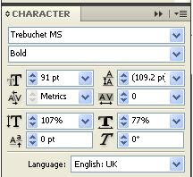 Changing the spacing between letters, making them closer together, also manipulating the height.
For the photograph of the LPs I used as a background I put a gradient layer over it, so that part of it was white, this meant that the text could be put over the top and read more easily.
 This all resulted in my final draft of a contents page.


For the photograph of the LPs I used as a background I put a gradient layer over it, so that part of it was white, this meant that the text could be put over the top and read more easily.


Font Experiment Contents Page

However I have concluded to stick with the same font that I used on the front of my magazine to have some continuation and as I feel it looks the most professional and most legible.
Contents Page Final Layout Sketch
After my sketching and looking back at my research I decided to work with the following design. Obviously I knew this could change when it came to producing the product as images, colours and the sizes could not work out.


Subscribe to:
Posts (Atom)