

One of the first things we did was to discuss how the media portrays people. Something people are always talking about. Mostly the negative effects it has on people, and the influence of it. We looked at the recent case with nurse Rebecca Leighton, and how when she was first suspected we saw a Facebook picture plastered across the media, which to us immediately gave us an irresponsible image of her. This was then contrasted with the photograph we saw after no evidence was found against her name to say she was guilty of poisoning patients. I found this a very good example to really understand how the media can take one person and change their image depending on the photograph. Helping me with my first task of taking a picture for a school magazine, portraying the subject (pupil/student) how I want to. I am definitely enjoying AS Media and am glad I have chosen it.
Magazine Front Cover Research


 This magazine cover shows the title very clearly and appears to be the main focus of the cover. It has a lot of text in comparison to the other magazine covers, with only a few photographs. The pictures also relate to the performing arts idea. I don't actually like this front cover as it is very busy with text and wouldn't draw me into the magazine. It seems very plain and boring to the eye with only the colours of white and black text. When thinking about the layout of my magazine cover I think I may try not to have as much writing and use the main focus of photographs to convey the story.
 Pierrot Doll and Front Cover Research
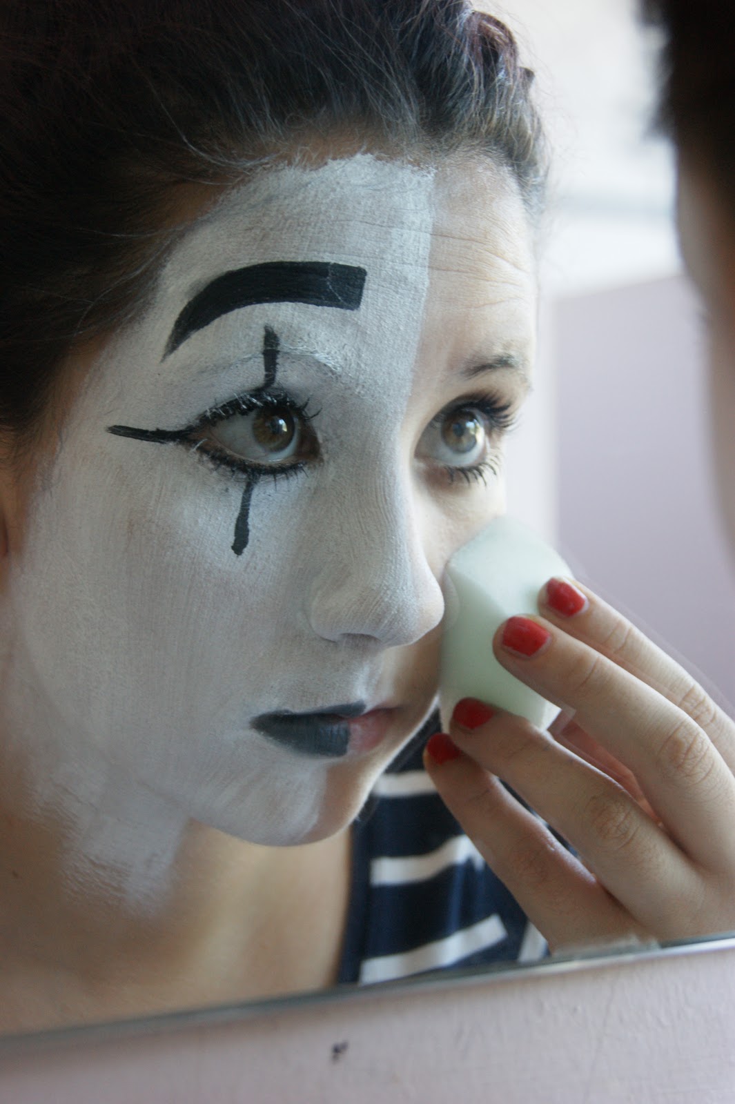
I chose to use the mime artist style of make up that is also very similar to the Pierrot doll look and make up. I have looked through both types of make up. I still very much like the idea of my subject 'getting ready'. However, I think I may think about the costume and what my subject is wearing and whether this will impact on the look of the photo.

I also looked at mime artist make up. The clothing and thought about incorporating this into my photograph. I just used simple white face paint, liquid and pencil eyeliner to create the clear cut look. Both of these are heavily related with performing arts and the history of it. Mime is one of the first ever forms of performing arts and expression.


Front Cover Photograph Research
First Photograph Comparison
I chose this photograph as it followed similar colour scheme as my magazine cover, it is in black and white focus. In addition to this the subjects in the photograph are looking upwards, but the photograph has been taken from the side rather than from above the subject. You can clearly see that the subjects are perhaps singing. I prefer the magazine cover picture as you get across more of the subjects character/personality in comparison to this one where all of the subjects look similar. Second Photograph Comparison

Third Photograph Comparison

Front Cover Sketches

First Photoshoot
 I decided to photograph my friend for my magazine cover and wanted to focus on the Performing Arts. I decided to look at make up and how this affects an actors performance. I looked at mime artist make up and decided to paint my friend's face in the same way but only half of it and have the picture as if she is getting ready for a performance. Covering up the real person to become this actor.
I disliked my first picture as I felt that it didn't look very performing arts, but more posed. The angle and lighting of the photo also isn't very effective. I decided to photograph my friend for my magazine cover and wanted to focus on the Performing Arts. I decided to look at make up and how this affects an actors performance. I looked at mime artist make up and decided to paint my friend's face in the same way but only half of it and have the picture as if she is getting ready for a performance. Covering up the real person to become this actor.
 I decided to change the angle of my picture entirely and take influence from my research and try using a reflection. I asked my subject to look as if she were preparing for a performance, and 'apply' the rest of her make up ready for performing. I particularly liked the angle of this. However in this picture the flash does not flatter the subject and produces a weird shadow around the subject. I could improve this by using a reflector to light both sides of the face to produce a neater effect.
The only problem I think I would have with this type of picture is that I would find it hard to place the writing around it and there isn't enough background space for the title and information.

 I liked this photograph because of the lighting, I also feels the photograph tells a story of the suject, preparing for a performance, it intrigues the reader/consumer to want to know more about the story/subject.
 Some of my research does not reflect the ideas of this photograph that I took. So I am going to do further research into similar pictures to see how I could improve this photograph.
Font Experiment with InDesign
These are my first font experiments with Adobe InDesign, I chose the title of Showtime for my performing arts school magazine. I experimented with the shape, colour, tracking, and kerning of the font. Deciding that I liked the colour of yellow as if it was in the spotlight, and I quite liked the italic type of writing. However I did not like the font with a background at the bottom of this page. I wanted the font to be quite fun, as is performing. 

This is my second page of font experiment, where I am starting to narrow down my ideas. I chose the colour of yellow, to reflect the lights. I particularly like the first font as it leanse away from one another similar to curtains on a stage do. I also like how the yellow colour appears to have lit the font and title from behind. The other two fonts I like the text but I feel that they are lacking a punch, and do not catch the eye that well.

This is my final font design, I decided to stick with the yellow background as if the title was lit in a spotlight. I also used a feather effect found on Adobe InDesign. This made the font appear to be shimmering and glittering, something often associated with the performing arts. I also like the black against the yellow as if a shadow has been created. I feel that it reflects the perfoming arts magazine well. However, I could have kept the kerning and tilted SHOW and TIME away from each other as I liked this effect as well.
Contents Page Research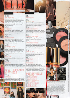
I chose this contents page because it was very busy. I liked the particular layout of the writing in the middle surrounded by pictures and what was in the magazine. They have certain pages which they wish to appear more important and highlight with bigger font, or different colour text. They also have an 'in every issue' section soomething which they obviously never change . Furthermore all the colours used on this page are of similar tones and shades, maybe making the page more appealing to the eye. However, I find that there are too many different people on the page. It would have maybe looked better with just the one model. 


I need to start thinking about the photograph I use on my contents page and whether I will change the model or keep the same theme. I have had an idea of using a dancer and giving the page more life and motion. I will have to think about how I place my information around the photograph and the colours. I need to think whether there will be a continual theme from the front cover into the contents page.
Contents Photograph Research
I have decided to look at different types of dancers. To see the sort of shapes I could take photographs of and how they would be in the layout of my contents page.


I need to also think about the colour, and how many models I will have in the photograph. All of the lines and shapes created in each of the photographs are very straight and concentrated.
Photoshoot Redo
I decided to retake the photographs of my model. I wanted to improve the lighting and overall composure of the photograph. Taking more into consideration the room around the object for a title and other information needed on the front cover of a magazine. I changed the background of the picture by changing the location to give me more scope and area to play with when placing my wording and other information.


There were some of the retake photographs which I really disliked because of the flash.
 It created a really horrible shadow and lighting on the subject. It also created a glare on the picture. I definitely decided against using these as soon as they were taken, that is why I just kept taking and taking photographs so that I could at least get a decent photograph.
This is also another bad example of a photograph I took, with the flash shown in the mirror and the shadow of the object over the picture.
Edited Magazine Photograph
On the left is the photograph I decided to use for the front of my performing arts magazine, I needed to edit it to make it more suitable. I used AdobePhotoshop to do this. Using different tools such cloning to remove unwanted objects, smudging and selecting specific areas. I am proud with how it came out considering I have never used a photoshop to this level before. 
Final Magazine Evaluation


1. In what ways does your media product use, develop or challenge forms and conventions of real media products?
Following the research I carried out on front covers of magazines and the contents pages I tried to reflect what I had learnt in my final creation. Although I did this with a photograph, title of the magazine, and text I feel that I could have achieved it better. I could have used inset photographs, and more of the rule of 3 layout when it came to the contents page. This would have improved the quality of my work and made it look more like an existing product and something professionally made.
2. How does your media product represent particular social groups?
My school magazine was aimed at the performing arts side of schools and education. I feel that it reflects quite a positive and lively atmosphere of performing arts and the different sides to it. The make-up I chose to use in the photograph on my model is quite traditional and very much associated with theatre and the history of performing arts.
3. What kind of media institution might distribute your media product and why?
Magazine companies that were in the performing arts area in particular may distribute it across to other places. However as it was a school magazine it would probably have to go to local institutions, such as libraries, other schools, local council/ shops.
4. Who would be the audience of your media product?
Students within the school may read the magazine, including their parents (friends and families) and teachers. Especially those who are interested in performing arts. People from the local area may also be interested in what is going on in schools around them.
5. How did it attract/address your audience?
The theme and the photograph on the front of the magazine would have told the target audience immediately what to expect in the magazine itself. In addition to this, the title of the magazine may have drawn them in to want to read it. The colours and lay out also appeared very fun and bubbly, however this could have been made more appealing to the audience by using theatrical colours, for example red curtains.
6. What have you learnt about technologies from the process of constructing the product
One of the first technologies I came across was the internet, in many different ways I found it troubling. I was okay using ‘blogger.com’ as I am already used to blogging. But when I was using ‘Google’ to research pictures and photographs I found that I had to become very specific with the sort of thing I was looking for. The next thing I had to get used to was Adobe InDesign, having never used this before or anything similar it was very much a trial and error. In addition to this learning to use Photoshop to the fullest to get the best out of my photograph. I feel more confident with the program and how it works. However, I will still need to spend some extra time working with it to properly get to grips and get the most out of the program.
7. Looking back at your preliminary task, what have you learnt in the progression from the beginning to the full product?
Towards the beginning of the task I was unsure of what I wanted to do then set my mind on an idea and followed through with it. I felt that the pictures for this idea went well and I learnt to retake them to improve the quality. From taking these photographs I have learnt about angles, and lighting. Thinking about the complete look of the photo and how best to take it. Doing the preliminary task helped me to learn how to use the needed programs and what to look for in a magazine front cover and contents page. However, I am not very happy with my final product as it doesn’t have a very professional layout or have a very high standard. There are lots of improvements that could be made, for example, colour and text choice. These could be made more appealing and carefully thought about for example picking colours from the photograph.
I also learnt how to control my time and make sure that I had a progression of thought and understanding, clearly showing how I concluded my research to reach my final product. I do still feel that I need to manage my time more carefully and use the resources available to get the best standard of work.
I also learnt how to control my time and make sure that I had a progression of thought and understanding, clearly showing how I concluded my research to reach my final product. I do still feel that I need to manage my time more carefully and use the resources available to get the best standard of work.