Showing posts with label Making of Rough Music Magazine Front Cover. Show all posts

Monday, 16 January 2012

Making of Rough Music Magazine Front Cover Continued

Following this I took my photograph into Adobe InDesign to create my front cover.
After placing the photograph I decided to add the font I had chosen, however, I have changed the colour. Making the font the same red as the lips, using the colour picker and having the outer glow of black.


Here is a short video clip of different components I had to experiment with when making my front cover.
My next step was to add a tag line, something to capture the readers attention, I had found this was used by magazines quite often and I decided to match it with the colours I am using but using a different font.
I then added another common feature, a circle with text in, usually advertising a competition. Here I introduce a 3rd colour to give the front cover more diversity. I also changed the angle at which part of the text stood to give it emphasis.
I then decided to change the angle at which the circle object sat.


When adding the text to the front cover I had to think about the type of music and bands that would appeal to my target audience. Here is a youtube video of one of the bands I chose.

I then started to add other magazine conventions, the text describing what was in the issue. I also created my own barcode to put on the front of the magazine, in another InDesign document copying it over. I also added a similar picture to the one I will be using in my double page spread, to show what is inside the magazine.


Resulting in my final rough magazine design. I will need to go back and tweek elements.

Making of Rough Music Magazine Front Cover

To get to my final front cover I had to go through various stages and trials and errors. Finding out what worked and what didn't, constantly referring to my research as I went a long.
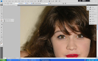
Once I had chosen the picture that best fitted the layout I had chosen for my front cover I decided to take it into Adobe Photoshop to edit it. The first thing I did was to eliminate any shadows caused by the lighting with the clone tool. I also used this to make colours more full and bright.


As I was still unhappy with how flat the model appeared I decided to look at the tone and contrast of the photograph. Then finally deciding to experiment with a black and white effect to create a more vintage style.


However, I felt I needed a focal point, something to stand out, so created a new layer and copied and pasted the red lips of my model onto this. Then applied the black and white effect, changing the hue and saturation of this. Then finally revealing the red lips as the top layer.


This is the photograph I ended up with to use on my front cover.