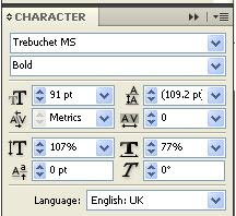
When making my contents page I tried to make sure that it followed on the similar style to my front cover by keeping the same font and colours, I did this by using the colour dropper. Not only this but I edited the text using the character tools.
Changing the spacing between letters, making them closer together, also manipulating the height.
For the photograph of the LPs I used as a background I put a gradient layer over it, so that part of it was white, this meant that the text could be put over the top and read more easily.
This all resulted in my final draft of a contents page.


