Thursday, 19 January 2012

Research Contents Page

I decided to look at different contents pages to get an idea of layout and the overall look and conventions that are used on contents pages to see if I could apply them to my contents page.
 This contents page has very cleverly used an entire picture as the background with the text and other features layered over the top. Similar colours have been used, greys, blacks and whites. With a very soft image and subtle look. The models legs creating the V shape of the title of the magazine. Keeping shapes similar and creating an easier layout to work with.


This contents page has used one picture surrounded by the text with subheadings, the black, white and red colours used throughtout and even matched in the picture by what the subject is wearing. There is a subscription box, showing a picture of this weeks issue, something often done by magazines. The same font and typeface is used throughout the page, with a very stuctured layout, following the rule of thirds.

 This contents page is very different to the last two and has a picture to go with each story that is in the issue. This making it more visual with less writing in ratio with the amount of pictures. The plain background white, with black writing on top keeps it very simple looking, again with the same font used throught the pages, with bolder bits and italic parts for quotes to stand out, to grab the readers attention.
 Similarly to the second contents page I looked at there is one main picture and another smaller picture used at the bottom of the page. Again it keeps the same colours, red, white and black with some grey colours as well. It also has subtitles and page numbers associated with each feature that is in the magazine that week. Highlighting what was on the front page as main features, it also has a section that is in the magazine every month, so regular pages that readers who get the magazine often know where to go for certain features they may like.
The main feature of this contents page is definitely the picture, it relates to one of the stories within the magazine, it has very little writing in comparison to the last few contents pages. It also commends the model and artists who created the front cover of this issue. With very simiple colours and a soft tone, similarly to the other magazines.


I have found that I need to probably keep the same font throughout the page and also simple colours, maybe 2 or 3. This would give the smartest and simplist effect. Also considering the rule of 3 when trying to layout my contents page, including photograph, title and features. Continuing the stories that are on my front cover, highlighting the most important one. Other conventions I can think about using is a subscription or a regulars section. These will all help to make my contents page look professional.

Wednesday, 18 January 2012

Final Front Cover

After looking at the evaluation points from the draft of my front cover I decided to make a few changes to the look of my front cover. I kept the same colour scheme, decided to use a new font and edited the way I made certain objects on the page. For example, the WIN circle in the top right hand corner of the page. The following print screens show how I made the text fit the shape of the circle to give a neater finish.


Above is a jpeg of my final front cover, the improvements have made my magazine have a more finished and neater look. The colour is now more evenly spread, and the photograph looks more natural and confident in comparison to the previous one I used. 

Tuesday, 17 January 2012

Second Photoshoot for Front Cover

Here are a few photographs that I took for my second photoshoot, these were taken after my other magazine front cover was completed as I realised that they needed to be of higher quality.


Front Cover Rough Evaluation

Monday, 16 January 2012

Making of Rough Music Magazine Front Cover Continued

Following this I took my photograph into Adobe InDesign to create my front cover.
After placing the photograph I decided to add the font I had chosen, however, I have changed the colour. Making the font the same red as the lips, using the colour picker and having the outer glow of black.


Here is a short video clip of different components I had to experiment with when making my front cover.
My next step was to add a tag line, something to capture the readers attention, I had found this was used by magazines quite often and I decided to match it with the colours I am using but using a different font.
I then added another common feature, a circle with text in, usually advertising a competition. Here I introduce a 3rd colour to give the front cover more diversity. I also changed the angle at which part of the text stood to give it emphasis.
I then decided to change the angle at which the circle object sat.


When adding the text to the front cover I had to think about the type of music and bands that would appeal to my target audience. Here is a youtube video of one of the bands I chose.

I then started to add other magazine conventions, the text describing what was in the issue. I also created my own barcode to put on the front of the magazine, in another InDesign document copying it over. I also added a similar picture to the one I will be using in my double page spread, to show what is inside the magazine.


Resulting in my final rough magazine design. I will need to go back and tweek elements.

Making of Rough Music Magazine Front Cover

To get to my final front cover I had to go through various stages and trials and errors. Finding out what worked and what didn't, constantly referring to my research as I went a long.
Once I had chosen the picture that best fitted the layout I had chosen for my front cover I decided to take it into Adobe Photoshop to edit it. The first thing I did was to eliminate any shadows caused by the lighting with the clone tool. I also used this to make colours more full and bright.


As I was still unhappy with how flat the model appeared I decided to look at the tone and contrast of the photograph. Then finally deciding to experiment with a black and white effect to create a more vintage style.


However, I felt I needed a focal point, something to stand out, so created a new layer and copied and pasted the red lips of my model onto this. Then applied the black and white effect, changing the hue and saturation of this. Then finally revealing the red lips as the top layer.


This is the photograph I ended up with to use on my front cover.

Monday, 12 December 2011

Font Experiment Front Cover

I decided to look into the fonts I could use for the title of my magazine, this also meant I had to think of a title, something simple and catchy that also suited the type of music magazine I am going to create. At first I just decided to look at the fonts the InDesign programme offered. Not changing the colour or shape of the title, I decided on the letter M as I felt it made an impact.


Following this I decided to look at these fonts again changing the colours and look of the font and style.
From this I then chose my final font for the front cover.

Saturday, 10 December 2011

Front Cover Layout Hand Sketches

Once I had taken my photographs I felt I needed to think about how I could lay these out on the page alongside a title text and other magazine conventions.
The best way to do this was by quickly sketching and seeing what I and my peers preferred.

After thinking about the amount of space and look on the eye I decided that the circled design may best fit the type of magazine I wanted to produce.

Monday, 28 November 2011

First Front Cover Photoshoot

I decided I need to just get stuck in and photograph my model, I knew that even if these first photographs did not go very well I would be able to take what went wrong and improve it.
I like the way my model is posed, however the lighting is unflattering, with the shadow behind and the glare of the flash is making her face appear flat. I could maybe think about changing the lighting and where I have taken the photo, hopefully using a professional type studio set up. As I know that we have the white backdrop and lighting available for use within school. Another option could be to photoshop it in Adobe to improve the flaws in the photograph.


Saturday, 26 November 2011

Research into How to Take a Black and White Photograph

Using one website in my research I found that I need to be particular about the type of lighting I use when taking my photograph. Using a lot of light to create shadows, dark and light areas. The contrast will make sure that the person is not flattened by the lack of colour.
In the picture below a lot of depth has been created, with the dark shades and light, to enhance the shape of the mans face.
I also found out that I need to experiment with the aperture on the camera, this is the size of the opening in the lens when the picture is taken. The less light let into the camera the more detailed the picture is. For example the picture of the girl below, has very fine detail, meaning you can see textures.
The main impact changing the aperture has on a picture is the depth of field. With a large aperture number, the depth of field is larger, meaning that the entire photograph is in focus. Whereas the smaller number of aperture, the smaller the depth of field this means a particular object in the foreground of the photograph will be more in focus than the background. Similar to the two photographs above. This may be a good idea to have a shallow depth of field in my front cover photograph as I can use the blurred background to add text over the top.

I decided to take a photograph from the internet that had a shallow depth of field and edit it myself into black and white, maybe keeping a particular part of it and keeping it in colour, to see whether I liked the outcome, and then decided to try a first photoshoot.

I think having a photograph like this would be very suitable for my front cover.

Friday, 25 November 2011

Research into Black and White Magazine Front Cover

After thinking about who I was going to photograph I also thought about the type of music magazine it would be, I have decided to look at a more vintage style, maybe experimenting with black and white. I have found a few magazines with a black and white front cover.
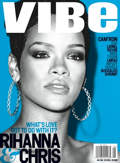
They have either used complete black and white or used black and white with coloured font and surroundings, this may prove a good effect for my magazine. I have decided to look at modern indie folk music and work around this.

I looked at this magazine front cover as, they have experimented with the black and white photograph with the text and colours surrounding it. I like how this has worked, but still find it to be a bit plain.


I have looked at this magazine front cover as it has the type of genre of music on the front, and there has been black and white with colours used again. There is also a more of exciting look as the models are over the title, giving a more 3D look.


Another use of a black and white image with a coloured background with black text, the coloured background brightens this front cover and gives it a differnt look to most conventional magazines.